Thursday, June 5, 2014

FINAL PROJECT: NARRATIVE ILLUSTRATION


MATERIALS:

Open medium: collage, drawing, painting, photography, Photoshop, Illustrator, etc.


REVIEW:

All “elements of design” and “principles of design” on 2ddesignnscc.blogspot.com


OBJECTIVE:

To create a 3-panel illustration of a narrative (story) from the following options:

-        Book (novel, poem, fairytale, etc.)
-        Song
-        Newspaper article or essay

Things to Consider
- choose your reference material based on your interest in the story as well as its potential for visual translation: are there words, objects, interactions that will make for a compelling illustration?
- rather than thinking about an entire book or song, consider narrowing the scope of your illustrations to single verses, chapters, scenes or lyrics.  Pick those that have rich visual language.
- you may take a representational or abstract approach: consider how all of the elements & principles of design can enhance the narrative
- how will you make your three images consistent? Color, shape, composition? Think visual style.


PREPARATION:
-        choose your reference material and make a list of the visual words & objects you find within the text
-        make a list of emotions you associate with the text: i.e. sad, confused, angry, joyful
-        decide on a color scheme & overall composition that reflects the above lists
-        create several rough drafts or sketches before deciding on three final designs


PRESENTATION:
-        any size or format you choose mounted on illustration board or Bristol paper with a border around it
-        Part of the inspiration text should be mounted with the design (text should be separate from your designs and should use simple font like Times New Roman, Helvetica, etc.).
-        ONE OPTION: three 6” x 8” designs and inspiration text mounted on 15” x 22” illustration board


QUESTIONS TO BE PRESENTED FOR FINAL CRITIQUE:

Describe the story you are illustrating: what is the emphasis of the narrative (the characters or subjects, the mood, etc.) and how did you relate this through your design choices?  How does your color palette reflect the feeling of the story?  How did you maintain consistency across the three illustrations while also achieving variety?  How do you think you were successful and what might you change if you were to illustrate this again?


DATES:

Studio time: Wed 6/4, Mon 6/9, Wed 6/11 (in-progress critique), Mon 6/16
Due:  Wed 6/18 (FINAL PRESENTATIONS)


PAST STUDENT EXAMPLES (please note: examples shown below are without the text, which is typically mounted below each image):




Tuesday, June 3, 2014

Supplies for Wed 6/4

Please bring in your finished Value to Color Projects for a short critique at the beginning of class tomorrow.

We'll then introduce our Final Project.  Please bring your sketchbooks and pencil.  If you have a laptop that would also be helpful as we'll spend class time researching inspiration for the project.


Monday, June 2, 2014

Extra Credit


EXTRA CREDIT: EXAGGERATED SCALE ADVERTISEMENT
2D Design NSCC


MATERIALS:

Bristol pad paper, xacto knife, cutting mat, glue stick, magazine/internet/found images OR Photoshop


REVIEW:

“SCALE {element of design}” and “PROPORTION {principle of design}” on 2ddesignnscc.blogspot.com


OBJECTIVE:

A photomontage using exaggerated scale (disproportion) to create a surreal or unreal image.
The image should be able to act as an advertisement for something (a product, a show, a political campaign, etc.)
No text allowed.  

Rules
- use collage with two or more found images of different sizes

To Consider
-        begin by researching advertisements and other images that use scale in interesting ways
-        at least one of your images should use exaggerated scale (size)
-        the advertisement aspect of your image may be something you come up with after creating the piece or may be something you think of beforehand.
-        The image does not need to directly relate to the product you are advertising (i.e. Cave men have nothing to do with GEICO auto insurance).


PRESENTATION:

Collage/Photoshop image of any size on Bristol pad paper (should have a border around it)


WRITTEN ASSESSMENT:

What are you intending to advertise?  How is exaggerated scale used in your image?  Is your image funny, surprising, strange?  How do you think that helps to communicate an idea more effectively?


DATES (subject to change):

Due: Wed June 18


Thursday, May 22, 2014

VALUE TO COLOR PROJECT


MATERIALS:

Acrylic paints (all colors), brushes, palette, palette knife, pencil, photo, transfer paper, matte medium, illustration board


REVIEW:

“COLOR {element of design}”, “VALUE {element of design}”, and “FORM {element of design}” on 2ddesignnscc.blogspot.com


OBJECTIVE:

A series of 5 paintings based on one image:

1.     Value painting – use only white, grays, and black
2.     Analogous Color painting – use 3 or 4 colors next to each other on the color wheel and white (no black!)
3.     Complementary Color painting – use only a complementary color pair (colors across the color wheel from each other), including mixing them together, and white (no black!)
4.     Color As Value painting – choose colors based on their inherent value (i.e. yellow = lightest value, violet = darkest value, etc), NO white or black!
5.     Tonal painting – using your Color as Value painting choices, mix each color down with gray to result in a muted tonal painting

Rules
- find a photographic portrait of a famous person (using Google image search à Large size photos)
- posterize image in Photoshop, resulting in an image with 6 values (to be done in class)
- transfer your Photoshopped image onto your illustration board as a line drawing in 5 separate squares
- use the color scheme restrictions above to complete the painting of your 5 compositions

Things to Consider
- label each area of your line drawings with a number that represents your value scale (1 being lightest, 6 being darkest); this will help you keep your design organized when you go to apply paint.


PREPARATION:

Email image to yourself (or bring on a disk/thumb drive)
Photoshop image and print out at 6” x 6”
Test color mixtures and schemes in your sketchbook before applying to your final piece


PRESENTATION:

Five 6” x 6” compositions lined up next to each other (6” x 30” rectangle) on 8” x 32” illustration board


WRITTEN ASSESSMENT:

What did you learn about color during this project?  How does color relate to value?  How do they both describe form and depth?  Which of the pieces is the most eye-catching to you?  Which is the most subtle or quiet image?  Which feels the most harmonious and which feels the most discordant?  How does color affect these things?


DATES (subject to change):

Studio time:
Mon 5/19: Introduce Project
*Homework: bring in image to Photoshop, work on Color Wheel
Wed 5/21: Photoshop image, finish Color Wheel
*Homework: bring in Color Wheel and all drawings transferred to illustration board
Mon 5/26: HOLIDAY
Wed 5/28: Value painting, Analogous painting
*Homework: Analogous painting, Complementary painting
Mon 6/2: Value as Color painting, Tonal painting
*Homework: finish Project
Critique: Wed 6/4


Monday, May 19, 2014

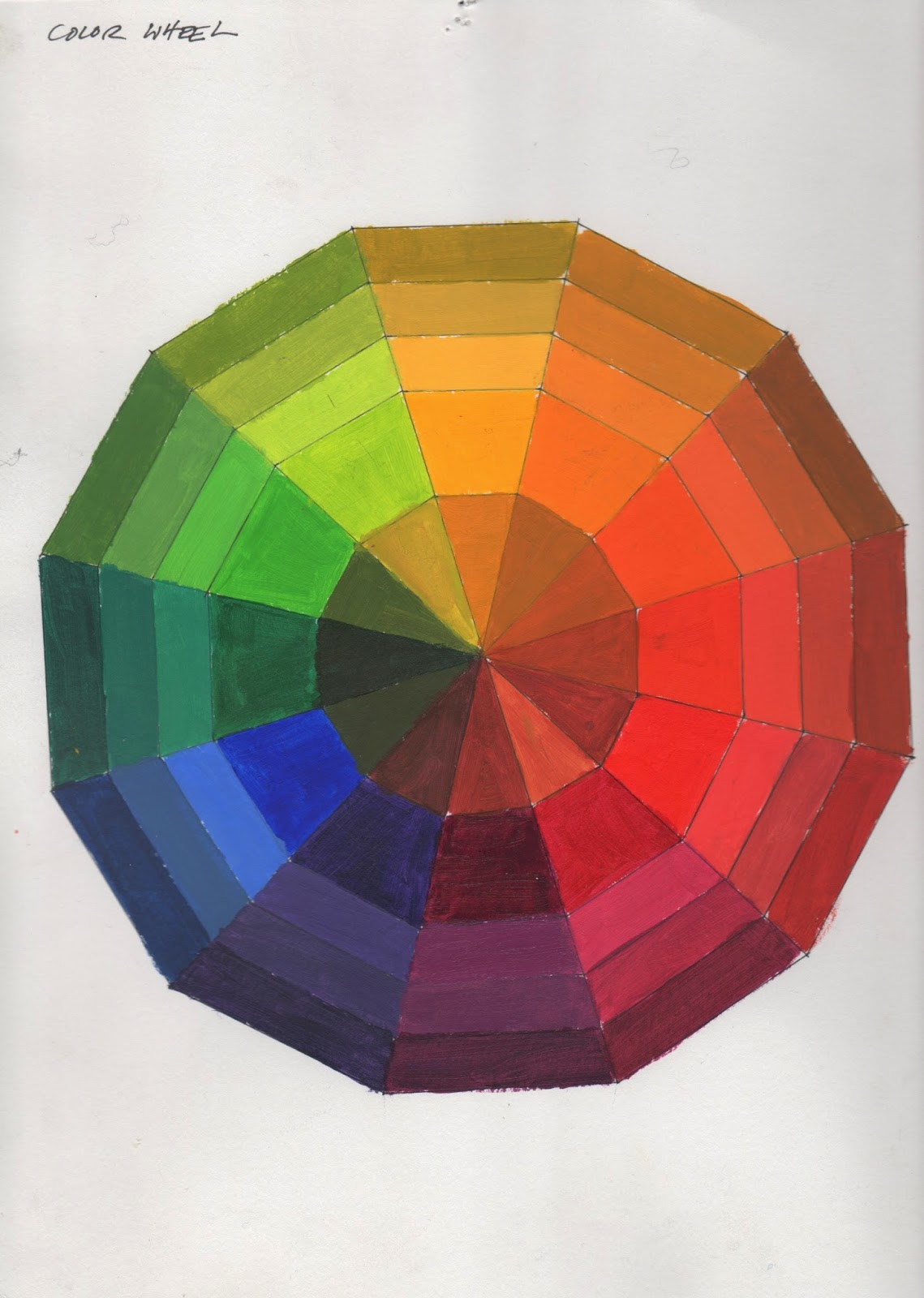
COLOR WHEEL


Please have your Color Wheels started for class on Wednesday - the 12 main colors should be mixed.  Consider an even progression of values as you go from Yellow to Violet in both directions.


Finished color wheel (fyi, the yellow appears too orange in this image)


Color wheel template


12 Color Wheel Mixtures (if using Fuschia)


12 Color Wheel Mixtures (if using Magenta)

STUDENT SHOW OPENING TOMORROW (TUESDAY)

Please come to the Student Art Show opening tomorrow (Tuesda), from 1-3 and 5-7!  

If you are in class, encourage your instructor to take a break and visit the show during class.  Support arts on campus!


Supplies for Wed 5/21

Please bring:

-Image of famous person (portrait only) - email to yourself or bring on thumb drive.  We will photoshop these together for your Value to Color Project.

-Color Wheel supplies:
all paints
brushes
palette knife
palette pad
bristol pad
template & mixing chart