Showing posts with label Principles of Design. Show all posts

Friday, December 23, 2011

UNITY & VARIETY {principle of design}

the dynamic balance that occurs when elements within an image are both similar (unified) enough to provide visual harmony, and different (varied) enough to provide interest


-the ultimate goal of any composition is to feel resolved, unified and balanced, while at the same time being dynamic and engaging; this is achieved through unity & variety

-unity comes from the repetition of similar elements: line, shape, color, form, texture & subject matter can all unify a composition

-variety comes from the uniqueness or contrast of disparate elements

-the following images can all be discussed in terms of the unifying and varying elements that make them up:

     ...Kandinsky's image is unified through repetition of shape, and varied through contrast of color & scale

     ...the image below is unified through repetition and proximity (closeness) of form (the figure), and varied through contrast of gestures and figure/ground relationships
Thomas Anshutz
     ...this calendar design utilizes similar shapes, font, symmetry & subject matter to unify all of its pages, while at the same time there is also variation between the subject matter (different animals), shapes and colors of each page
Loopz design on Etsy

     ...Andy Warhol intentionally used the act of repetition in his work to point to the mass-production of pop culture and his pieces were always heavily unified, though you can still see variety within his color choices
Andy Warhol
     ...Jacob Lawrence's paintings are dynamically varied through the use of different shapes and forms, but if you look more closely you begin to see patterns of color and forms emerging (particularly the rectangles and green areas in the middle of the canvas) that unify the picture plane

     ...this book cover uses the repetition of lines and geometric forms to unify the composition and tie the font to the rest of the image, while the variation of the color and scale of the forms adds interest


     ...these package designs and accessories are made up of different materials and no two utilize the same elements, but they use color and a similar geometric style of patterns and shapes to feel more cohesive
M Stetson design
     ...finally, you can have images that look completely different but are tied together through a common theme or subject matter, like this holiday display; style-wise they are unrelated, but together they add up to a unified story
I Need Nice Things dot com


Wednesday, December 21, 2011

MOVEMENT {principle of design}

1. a feeling of action within an image; OR
2. the path the viewer's eye follows through the image


1. the sensation of objects moving within an image can be alluded to through the use of various visual elements


-curves can give a sense of motion as these lines are not tied to the vertical and horizontal structure of the picture plane
Vincent Van Gogh
     ...they allude to rotating, tumbling, swinging, swaying, and swirling through space
Hexagonall
Sonia Delauney
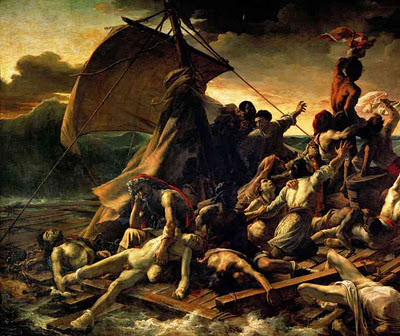
-diagonals have a similar sense of force and motion in design, alluding to tilting, falling, rising, or projecting forward or backward
Theodore Gericault


Wassily Kandinsky


-repetition and rotation of a form within an image will also create a sense of movement, as our eye will infer the action of the form turning in space
Marcel Duchamp


Vodaphone Headquarters, Portugal


2.  The viewer's eye can be purposefully moved throughout a composition to maintain a sense of visual harmony, as well as direct us to a focal point within the image


-directional lines (actual and implied lines, and gazes) can direct the viewer's eye to a focal point within a composition, communicating what is most important in a design


Mary Cassatt


     ...or keep the eye moving around the composition, maintaining a sense of visual equilibrium (see the discussion in Balance)
James Whistler
-repetition of similar shapes, colors, patterns, & forms can also bounce the eye around and through a composition, while keeping the image unified


EMPHASIS {principle of design}

the focal point of a composition; directs the viewer to the most important aspect of an image, creating a sense of visual hierarchy;
a significant tool in visual communication


-the use of contrast is one way to emphasize a certain element within a composition


     ...contrast through value
Tobias Van Schneider
22 ad campaign


     ...contrast through color


Sandy Skoglund


     ...contrast through scale


Connex


-placement within the composition can also create a sense of emphasis


     ...forms that are centered within the picture plane often appear to be the most visually significant


Nicholas Poussin


     ...isolated forms that are alone on the picture plane and surrounded by negative space can also feel emphasized 
Andrew Wyeth


-directional lines (actual and implied lines, and gazes) can direct the viewer's eye to a focal point within a composition


Mary Cassatt


Monday, December 19, 2011

PROPORTION {principle of design}

the relative scale of the various elements of a design in relation to each other and to the picture plane


-the proportion of individual elements in relation to one another can create a sense of pictorial space and hierarchy (scale of importance) within a composition


     ...larger elements generally feel closer and more important than smaller elements in the same image
Gustave Caillebotte


     ...if all elements within a composition are similarly scaled, the sense of space and hierarchy will flatten, resulting in a more simplified, two-dimensional image


Henri Matisse


-proportion also refers to the scale of elements in relation to the space or picture plane they occupy


     ...larger forms will feel in proportion within a large picture plane and smaller forms within a smaller picture plane (think of the size of furnishings in relation to the size of a room)


    ...individual forms that take up the entire picture plane (with very little negative space) will feel powerful and attention-grabbing, and strain against the border of the composition; in certain instances their proportion may feel overwhelming within the space
Walton Ford
     ...forms that take up very little of the picture plane (with ample negative space surrounding them) will feel diminutive and isolated, and require the viewer to look more closely at the image; in certain instances their proportion may feel overwhelmed by the space


H57
-consider the overall proportion of elements to one another and to the picture plane within the following images


     ...the forms within this photo feel large and formidable because of their size in relation to the size of the image, and the composition as a whole feels crowded due to the lack of negative space; in addition, each major element (the eiffel tower, the building at left, and the canopy of trees) takes up a similar amount of the picture plane, resulting in a lack of variety.


     ...the following image also feels crowded due to an abundance of similarly-sized elements; there is no sense of hierarchy and thus the overall effect is chaotic, which may be intentional


-it is important to understand that distorted proportion is a visual tool designers may use intentionally for a variety of reasons:


     ...for impact
George Orwell "1984" cover


     ...for humor
Jeff Koons


     ...for surprise
Ron Mueck
     ...and for emphasis


     ...when something is out of proportion it tricks the eye, forces us to look more closely, and provides visual cues for us to follow


Saturday, December 17, 2011

BALANCE {principle of design}

the concept of visual equilibrium; the distribution of weighted elements across the composition to achieve stability;
there are two main types of balance in composition:


1. symmetrical
2. asymmetrical


1. symmetrical balance refers to the use of a mirror image, with one side being identical to the other along a central axis
Judy Chicago


     ...it is also called formal balance because it is considered highly organized and ordered


     ...we gravitate to symmetrical balance as a visual device partly because our bodies are symmetrical; symmetry makes for an easy, simplified reading of complex compositions


Frank Stella
-approximate symmetry is a composition that is almost identical along a central axis, but has some variation in its parts; this variation can add interest to an otherwise static composition


Raphael
-radial symmetry refers to an image that is symmetrical around a central point
Brian Schmitt

Jonathan Higgins
-symmetrical compositions have built-in balance, but in some cases can feel static, overly ordered, and, perhaps, boring; however, balance can be achieved through means other than using formal symmetry


2. asymmetrical balance refers to the visual equilibrium achieved with disparate elements; it takes into consideration the visual weight of these elements and how they are distributed across a composition


-the ultimate purpose is to achieve a sense of stability so that we don't feel the composition is tipping over or pulling off the page in one direction, but bringing us back to the center


-it is harder to achieve asymmetrical balance as there is no set formula to do so, but there are general organizational tools to consider


-scale: a larger object or shape can be balanced by several smaller objects or shapes on the other side of a central fulcrum; or by one smaller object farther away from the center of the composition; 


     ...notice the large shape of the white dress balanced by the smaller items in the upper and lower right corners of the Whistler painting
James Whistler


     ...the poster below is similarly balanced through scale, with the large flamingo and text on blue background countered by the smaller groupings of text and flamingos below it
Jeremy Darty


-detail: small, highly detailed images such as text and faces have visual pull and can balance larger images of less significance


     ...in the Degas painting, the dancer's small face is emphasized through detail and high contrast and counterbalances the larger areas of negative space and active brushwork behind her
Edgar Degas
     ...in the movie poster below, the small text at the bottom center of the composition balances the diagonal upward thrust of the large beam of light, as well as the large areas of negative space


Hexagonall


-contrast: areas of high value contrast can balance each other or can counterbalance larger areas of lower contrast


     ...in this DiChirico painting, the high value contrast of the black doors and windows on the white building are balanced by the high value contrast of the yellow bus doors and the sharp diagonal shadow cast onto the road


Giorgio DiChirico
     ...similarly, in the Poussin painting, the high contrast area of figures at center-left are visually counter-balanced by the high contrast of the small foot at the far right of the composition; all of this is balanced by the areas of low contrast surrounding the figures


Nicholas Poussin
     ...the chocolate packaging design below uses contrast to emphasize the image on the top of the composition (with the highest contrast occurring at the center of the bar), but is balanced by the visual pull of the text at the bottom
Puigdemont Roca


-directional lines: compositional elements such as figural gestures and gazes, as well as implied or real lines can move our eye around a composition and keep it from going off the page


     ...in the Poussin painting, the two figures on the left look toward the center of the composition, returning the gaze of the central figure of Jesus; the implied lines of the entire group of figures (which create a triangle) also resolve at the center of the composition
     ...Whistler uses the directional gaze of the woman to direct our eye around the composition, from her eyes to the reflected face in the mirror which again directs our eyes downward to her left hand; the implied line that exists between the woman's two hands (similarity) draws us down to the bottom center of the composition and her right arm completes the circle back up to her face


James Whistler
     ...the vertical line of the dancer in the Degas painting pulls our eye downward towards her foot and the gray negative space while the gesture of her head and arms pull us back upward toward the center of the composition; her left arm holds the right side of the composition and pushes back the active space behind her


Edgar Degas


     ...the small figure of the girl at the lower left-hand corner of the DiChirico painting does a great amount of work; the upward motion of her body keeps our eyes from falling down off the picture plane and thus counters the sharp diagonals of the road
Giorgio DiChirico


-one can see that there are generally multiple forces of balance at work in each successful composition


**the ultimate goal in design, whether using symmetrical or asymmetrical composition, is to achieve a sense of dynamic balance, with enough interest and opposing forces to keep our attention, while also maintaining a sense of resolution and visual equilibrium