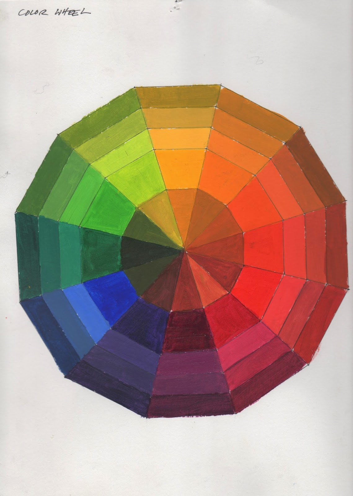
MATERIALS:
Acrylic paints (all colors),
brushes, palette, palette knife, pencil, photo, transfer paper, matte medium,
illustration board
REVIEW:
“COLOR {element of design}”,
“VALUE {element of design}”, and “FORM {element of design}” on 2ddesignnscc.blogspot.com
OBJECTIVE:
A series of 5 paintings based on
one image:
1.
Value painting – use only white, grays, and black
2.
Analogous Color painting – use 3 or 4 colors next
to each other on the color wheel and white (no black!)
3.
Complementary Color painting – use only a complementary
color pair (colors across the color wheel from each other), including mixing them together, and white (no black!)
4.
Color As Value painting – choose colors based on
their inherent value (i.e. yellow = lightest value, violet = darkest value,
etc), NO white or black!
5.
Tonal painting – using your Color as Value painting
choices, mix each color down with gray to result in a muted tonal painting
Rules
- find a photographic portrait of a famous person (using
Google image search à Large
size photos)
- posterize image in Photoshop, resulting in an image with
6 values (to be done in class)
- transfer your Photoshopped image onto your illustration
board as a line drawing in 5 separate squares
- use the color scheme restrictions above to complete the
painting of your 5 compositions
Things to Consider
- label each area of your line drawings with a number that
represents your value scale (1 being lightest, 6 being darkest); this will help
you keep your design organized when you go to apply paint.
PREPARATION:
Email image to yourself (or bring on a disk/thumb drive)
Photoshop image and print out at 6” x 6”
Test color mixtures and schemes in your sketchbook before
applying to your final piece
PRESENTATION:
Five 6” x 6” compositions lined up next to each other (6”
x 30” rectangle) on 8” x 32” illustration board
WRITTEN ASSESSMENT:
What did you learn about color during this project? How does color relate to value? How do they both describe form and
depth? Which of the pieces is the
most eye-catching to you? Which is
the most subtle or quiet image?
Which feels the most harmonious and which feels the most
discordant? How does color affect
these things?
DATES (subject to change):
Studio time:
Mon 5/19: Introduce Project
*Homework: bring in image to Photoshop, work on Color
Wheel
Wed 5/21: Photoshop image, finish Color Wheel
*Homework: bring in Color Wheel and all drawings
transferred to illustration board
Mon 5/26: HOLIDAY
Wed 5/28: Value painting, Analogous painting
*Homework: Analogous painting, Complementary painting
Mon 6/2: Value as Color painting, Tonal painting
*Homework: finish Project
Critique: Wed 6/4


