there are two main types of balance in composition:
1. symmetrical
2. asymmetrical
1. symmetrical balance refers to the use of a mirror image, with one side being identical to the other along a central axis
 |
| Judy Chicago |
...it is also called formal balance because it is considered highly organized and ordered

...we gravitate to symmetrical balance as a visual device partly because our bodies are symmetrical; symmetry makes for an easy, simplified reading of complex compositions
 |
| Frank Stella |
 |
| Raphael |
 |
| Brian Schmitt |

 |
| Jonathan Higgins |
2. asymmetrical balance refers to the visual equilibrium achieved with disparate elements; it takes into consideration the visual weight of these elements and how they are distributed across a composition
-the ultimate purpose is to achieve a sense of stability so that we don't feel the composition is tipping over or pulling off the page in one direction, but bringing us back to the center
-it is harder to achieve asymmetrical balance as there is no set formula to do so, but there are general organizational tools to consider


-scale: a larger object or shape can be balanced by several smaller objects or shapes on the other side of a central fulcrum; or by one smaller object farther away from the center of the composition;
...notice the large shape of the white dress balanced by the smaller items in the upper and lower right corners of the Whistler painting
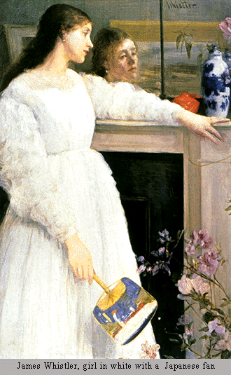 |
| James Whistler |
...the poster below is similarly balanced through scale, with the large flamingo and text on blue background countered by the smaller groupings of text and flamingos below it
 |
| Jeremy Darty |
-detail: small, highly detailed images such as text and faces have visual pull and can balance larger images of less significance
...in the Degas painting, the dancer's small face is emphasized through detail and high contrast and counterbalances the larger areas of negative space and active brushwork behind her
 |
| Edgar Degas |
 |
| Hexagonall |
-contrast: areas of high value contrast can balance each other or can counterbalance larger areas of lower contrast
...in this DiChirico painting, the high value contrast of the black doors and windows on the white building are balanced by the high value contrast of the yellow bus doors and the sharp diagonal shadow cast onto the road
 |
| Giorgio DiChirico |
 |
| Nicholas Poussin |
 |
| Puigdemont Roca |
-directional lines: compositional elements such as figural gestures and gazes, as well as implied or real lines can move our eye around a composition and keep it from going off the page
...in the Poussin painting, the two figures on the left look toward the center of the composition, returning the gaze of the central figure of Jesus; the implied lines of the entire group of figures (which create a triangle) also resolve at the center of the composition
 |
| James Whistler |
|
| Edgar Degas |
...the small figure of the girl at the lower left-hand corner of the DiChirico painting does a great amount of work; the upward motion of her body keeps our eyes from falling down off the picture plane and thus counters the sharp diagonals of the road
 |
| Giorgio DiChirico |
-one can see that there are generally multiple forces of balance at work in each successful composition
**the ultimate goal in design, whether using symmetrical or asymmetrical composition, is to achieve a sense of dynamic balance, with enough interest and opposing forces to keep our attention, while also maintaining a sense of resolution and visual equilibrium
No comments:
Post a Comment